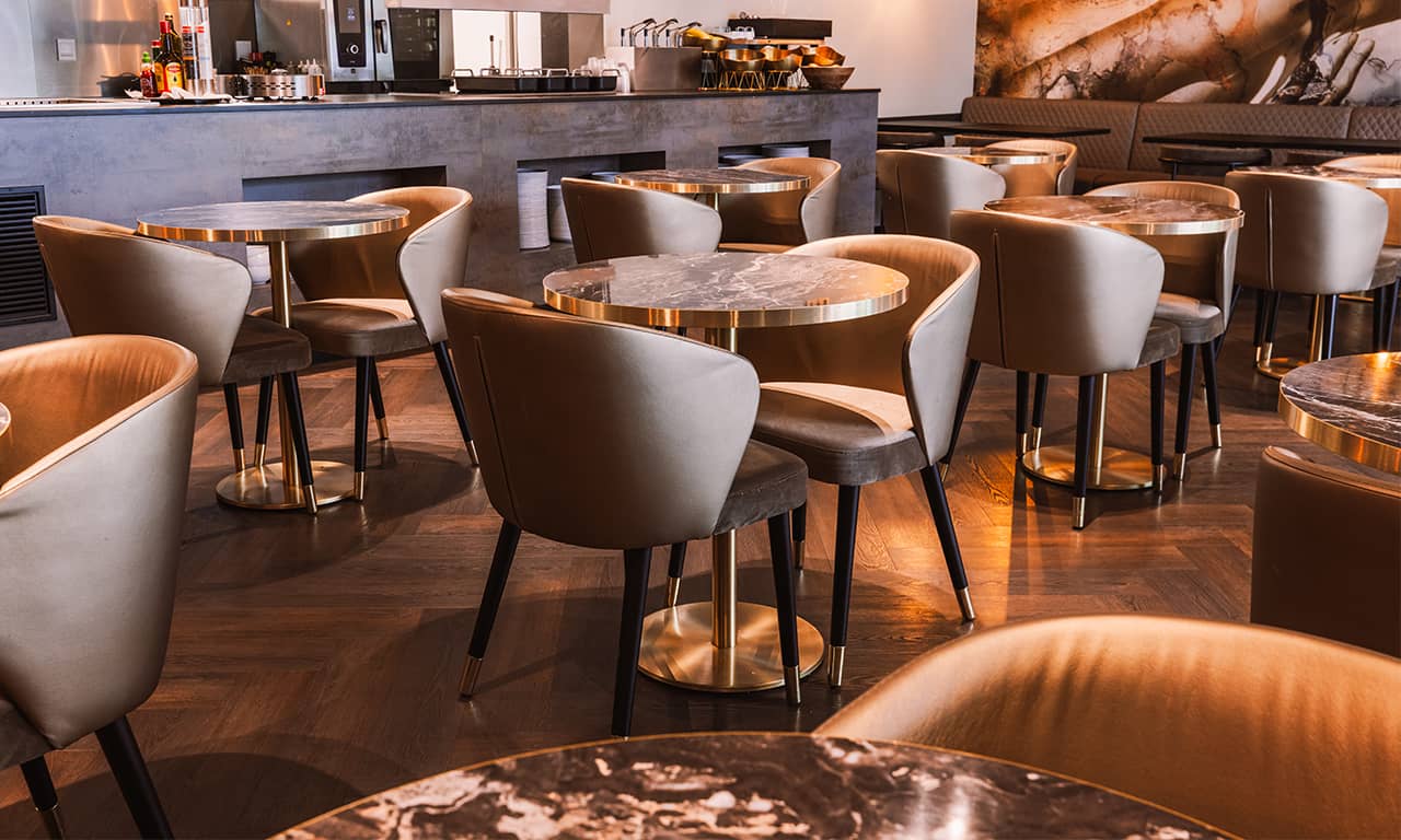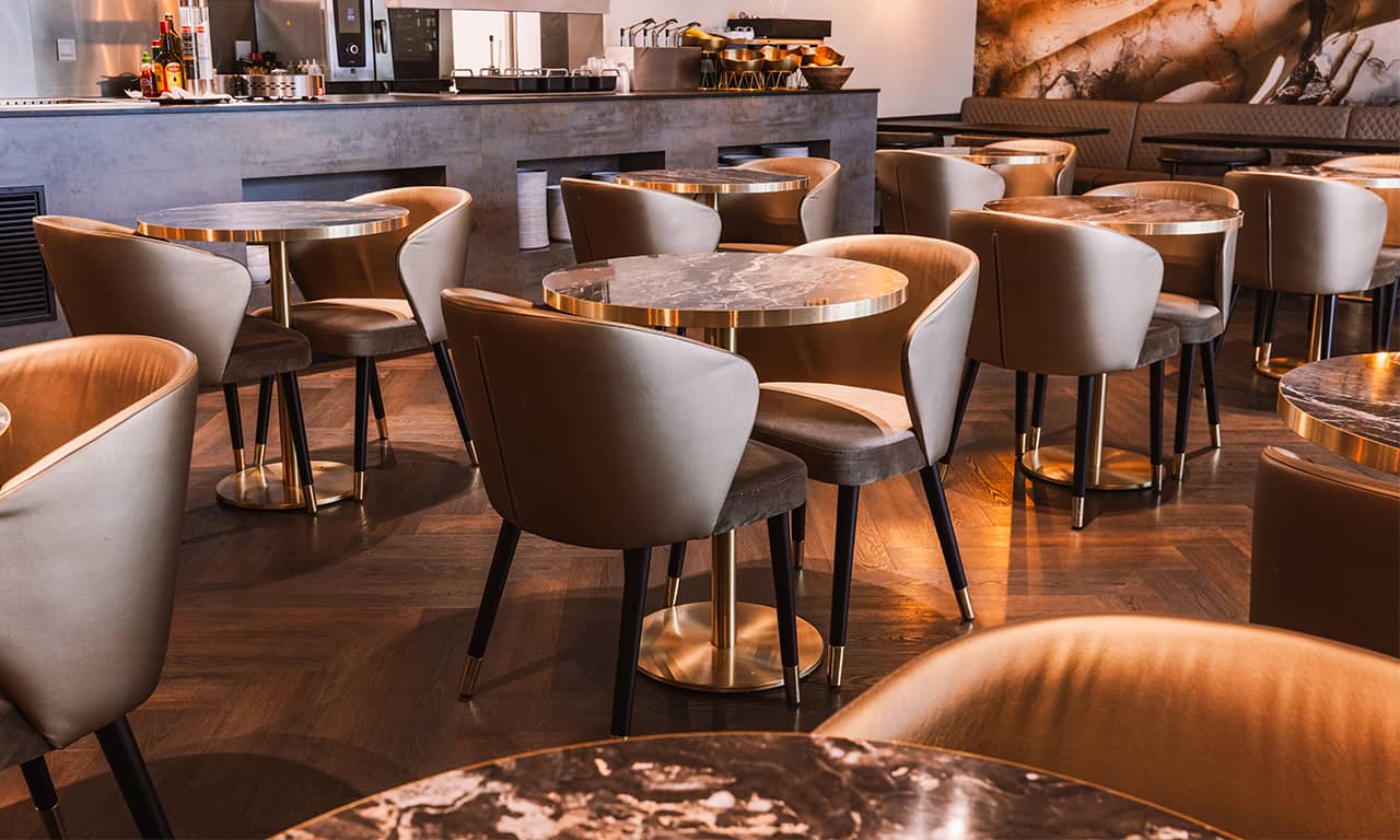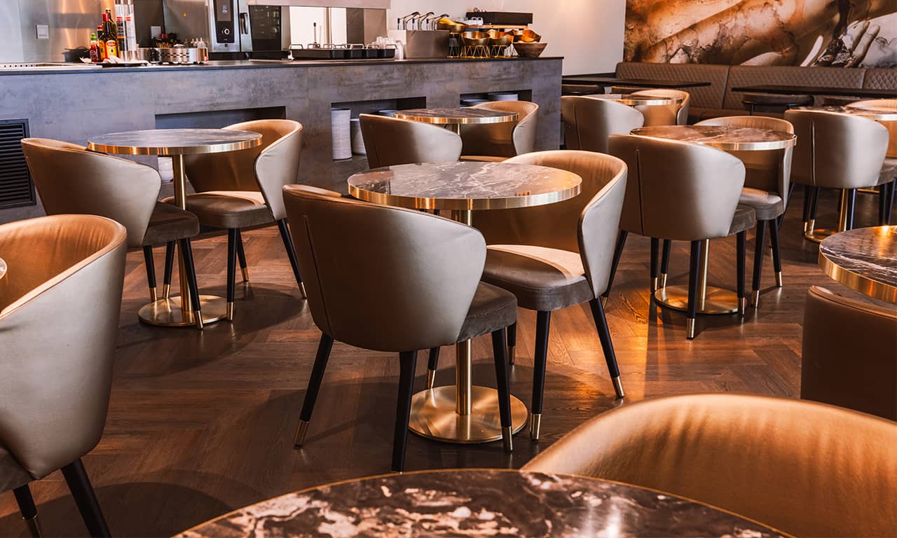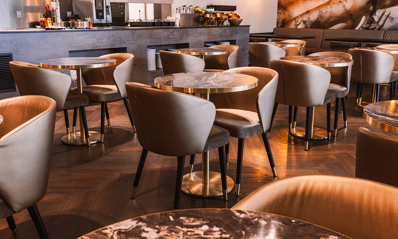
Guests form an impression of a hotel or restaurant within seconds of walking in. Much of it comes from things they never consciously name, the color on the walls, the texture underfoot, the way a chair feels when they sit. Hospitality designers know this, and heading into 2027, their palettes and material choices are shifting in a clear direction. The look is less about spectacle and more about how a space feels, interiors are warmer, more tactile and more rooted in their surroundings than the polished, uniform hotels of a decade ago. Four trends are driving that shift.
1. Green in Many Shades

If one color defines the run-up to 2027, it is green, and the striking thing is its range. Forecasters and paint makers are pointing to shades that share little beyond a family name, a deep, mossy olive with brown undertones, a soft and dusty sage, a pale herbal green with a hint of yellow. Green is no longer a single "nature" color reserved for a planter or an accent wall, it is a spectrum that designers can tune to almost any mood.
That flexibility explains the appeal. Green reads as restorative at a moment when guests choose hotels for rest as much as for location, yet it can also feel indulgent. A lounge in deep olive, softly lit and finished with burnished brass and velvet, has a warm, considered character. A guestroom in pale herbal green feels fresh and open, with an easy connection to the outdoors. Designers are also letting the color travel, running it in gradients through tile, textiles and artwork so the hue drifts through a space instead of stopping at one wall, the result ties a property to the outdoors without a single potted plant.
2. Earthy Warmth and Jewel Tones
Cool grays and stark whites dominated hospitality interiors for years. Warmer palettes are replacing them, terracotta, clay, caramel and deep brown, with deeper reds and jewel tones used where a space calls for more drama.
What distinguishes this cycle from earlier earth-tone trends is saturation and layering. Instead of a single beige, designers combine several warm shades in one room, often in tonal schemes where walls, seating and joinery sit close together in color. Deeper tones tend to appear in bars, restaurants and lounges, where lighting is lower and guests stay for a set purpose, lobbies and guestrooms lean toward softer clay and sand tones. Jewel tones are typically used sparingly, on a chair, a door or a single feature room, so they add contrast without dominating the scheme. The overall aim is a palette that feels grounded and deliberate rather than cautiously neutral.

3. Texture and Material Honesty
Surface quality is receiving more attention alongside appearance. Natural, tactile materials are in wider use, stone, cork, leather, wood, bouclé, wool and woven fibers. Layering these adds visual depth, and softer materials also contribute to acoustic comfort, a concern in restaurants and public areas.
A related idea is material honesty, meaning finishes that show age and use rather than hiding it. Honed stone softens over time, leather develops a patina, and plaster or limewash retains the variation of hand application, visible wear is treated as part of the material's character rather than a reason for replacement. There is a practical side to this, materials that can be repaired or refinished instead of replaced can reduce waste and lengthen the interval between refurbishments, which matters for operating costs and sustainability targets.
Planning a Refresh Around These Trends?
Our team designs custom furniture and interiors for hotels, restaurants and cafés.
4. Sense of Place and Embedded Wellness
Interiors that could sit in any city are giving way, in many projects, to ones that take the location as a starting point. That can mean regional stone and timber, local craft traditions, and colors drawn from the surrounding landscape, such as desert dusk, coastal haze or alpine forest. Work with local artisans and artists adds a distinct identity to a property and can support local economies, it also makes a property harder for competitors to replicate, which carries commercial value in a crowded market.
Wellness is following a similar path, moving out of dedicated spa and gym areas and into the building itself. In practice this includes daylight, natural materials, ventilation and air quality, acoustic comfort, and lighting that follows the rhythm of the day. Sleep quality is a common focus, which affects choices such as blackout provisions, quieter room layouts and softer evening lighting. Rather than a single wellness amenity, the emphasis is on spaces that feel restorative overall, place and wellness connect in that both respond to guests who want a stay that feels specific to where they are and supports rest.

What's Receding
Some looks are losing ground. Stark white-on-white minimalism and cool, all-gray schemes are being replaced in many projects by warmer, more layered palettes. White is not disappearing, softer whites continue to serve as neutral backdrops for color and texture, it is the sterile, all-white room that is declining. Industrial styling built around bare bulbs and exposed finishes is also giving way to softer lighting and more comfortable surfaces.
Interiors created mainly to photograph well are drawing less emphasis as well. A striking feature wall can still attract attention online, but operators increasingly weigh how a space performs over years of daily use, including how it sounds, how it ages, and whether guests want to linger in it. The shift does not rule out visual impact, it changes the question from whether a space will be noticed to whether it will hold up.
These Trends Are Still Developing
Cost and durability will refine the picture. Much of the visible change will come through renovations and refreshes rather than new builds, where budgets, brand standards and performance requirements shape what is practical. Green and warm palettes are relatively easy to introduce through paint, textiles and soft furnishings, while material changes such as stone, timber and specialty plaster involve larger commitments, that difference may mean color shifts arrive faster than material ones.

Your Color and Material Trends Checklist
- Considered green as a spectrum, not a single accent shade
- Chosen a tonal, layered warm palette rather than one flat beige
- Reserved jewel tones for sparing use, one chair, one door or one feature room
- Introduced natural, tactile materials such as stone, cork, leather or wool for depth and acoustic comfort
- Selected finishes that age well and can be refinished rather than replaced
- Drawn colors and materials from the local landscape or craft tradition where possible
- Built wellness considerations, daylight, acoustics, sleep-friendly lighting, into the wider space
- Weighed cost and durability, starting with color changes before larger material commitments
Four trends share a common thread, interiors are becoming warmer, more tactile and more specific to where they are. Guests notice this within seconds of walking in, even when they cannot name exactly why a space feels right. If you are planning a refresh around these trends, our team designs custom furniture and interiors for hotels, restaurants and cafés, get in touch to discuss how your venue can bring warmth and character into every space guests notice.
If you found this useful, you may also enjoy our article on Hospitality Furniture Trends to Watch in 2027.
OUR SERVICES
MORE FROM OUR BLOG
About P&M Furniture
P&M Furniture designs and delivers commercial-grade furniture for hotels, restaurants, cafes and bars across Europe, combining durability with design that supports how each venue actually works.
Planning a Refresh Around These Trends?
Our team designs custom furniture and interiors for hotels, restaurants and cafés.
Request a Quote